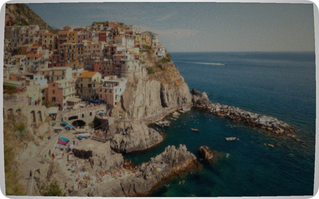
CRT / Old TV Converter
Seven presets from NTSC and PAL colour TV to phosphor green terminal, amber and Soviet SECAM. Adjustable scanlines, phosphor glow, barrel distortion, interlace artifacts and noise.
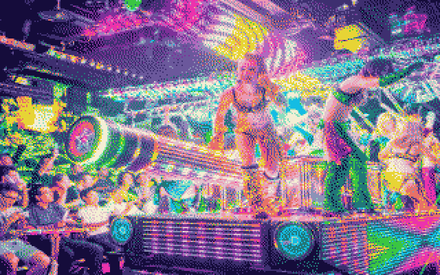
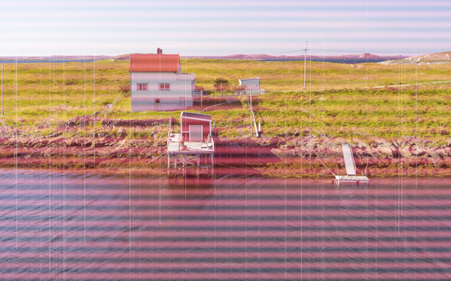
Five converters for turning and photo into the look of classic 80s and 90s technology. CRT television, Commodore 64 / CBM 64, halftone newspaper, dot matrix printer and low ink cartridge print. All processing locally in your browser using the Canvas API.
Seven presets from NTSC and PAL colour TV to phosphor green terminal, amber and Soviet SECAM. Adjustable scanlines, phosphor glow, barrel distortion, interlace artifacts and noise.
Authentic VIC-II 16-colour palette with four dithering algorithms. Three resolutions: 320×200 hires, 160×200 multicolour and 80×50 chunky, same constraints as the CBM64 hardware.
Simulate the Star LC-10 colour printer in Draft, NLQ and Photo quality modes. Colour or monochrome with adjustable ribbon wear, contrast and colour pop.
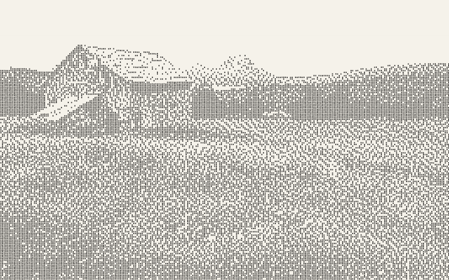
Classic newspaper dot printing. Control dot size, screen angle (0–90°), dot shape: circle, square, diamond or cross, and four aged paper tones.
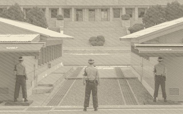
The faded, low toner look of a dying cartridge. Simulate streaking, horizontal banding, washed out colour and missing ink channels.
Dithering is central for low-resolution
Dithering is how to reproduce continuous-tone photographs with few colours and low resolution, like a colourful sunset using only a handful of colours, or pure black and white. Dithering is the arrangement of pixels in patterns to fool the eye into seeing shades that the display, or printer, cannot actually produce. Viewed from reading distance, the brain averages nearby dots together and perceives a smooth gradient.
The basic approach "if the pixel is darker than 128, print a black dot; otherwise leave it blank" gives a harsh cut with no grey at all. That is what the None (Threshold) mode does. Dithering distributes the rounding error from each pixel to its neighbours, so the overall average brightness stays correct across the image.
When a pixel is rounded (say a 90-brightness pixel becomes white), the error (90 − 255 = −165) is pushed to the right neighbour and the row below in fixed proportions (7⁄16, 3⁄16, 5⁄16, 1⁄16). Those neighbours "remember" they owe darkness and are more likely to become black. The result is organic, flowing dot patterns that follow image contours. Best overall quality.
Similar to Floyd-Steinberg but only propagates ¾ of the error, the remainder is discarded. Bright highlights stay very clean and white, but deep shadows can lose detail. Looks slightly lighter and crisper than Floyd-Steinberg. Developed at Apple for the original Macintosh.
No error diffusion. Each pixel is compared against a fixed 4×4 grid of threshold values that repeats across the whole image, producing a regular geometric dot pattern. A visible crosshatch texture that looks mechanical and "printed". The most authentically computer-era result; closest to what the C64 and early printers actually used.
Pure cutoff. Below the threshold value = black dot; above = nothing. Produces harsh, posterised output with no grey at all. Only useful for high-contrast graphic effects or when you want the maximum "stencil" look. In colour mode the same binary logic applies per ink channel.
In colour mode the same principle applies but per ink channel, pixels with low colour saturation receive fewer coloured dots, highly saturated pixels receive more, and the chosen dithering algorithm decides which individual pixels get a dot to hit the right average coverage.