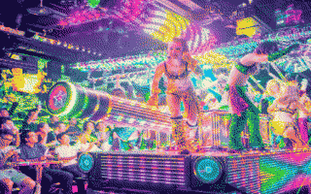
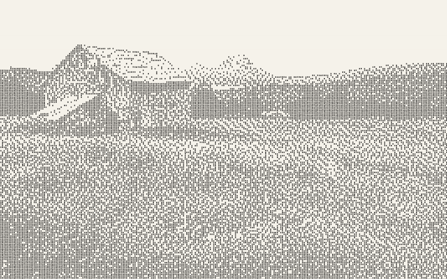
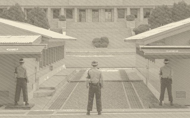
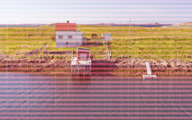
Large image files supported

Retro image converters

Supports: jpgpnggifwebp

Image converters for typical 80 and 90 technology in your browser, note big images might make them slow depending upon your hardware.

Celebration the quirks, distortion and limitation of early rendering technology, with its flaws the imagination had to complete what the machine could not.

Learn, what made this tech what is was

Dither

Dithering is how the printer fakes grey and colour using only solid black dots on white paper.

The printer has no grey ink. It can only fire a pin or not fire it — a dot exists or it doesn't. But your eye blends nearby dots together when you view them from a distance. So if half the dots in an area are fired and half aren't, your eye perceives it as 50% grey. If 20% fire, it looks light grey. If 80% fire, dark grey.

The problem: if you just say "fire a dot wherever the pixel is darker than 128", you get a hard cut — everything above the threshold is white, everything below is black. No grey at all. That's what "None (Threshold)" does.

Dithering solves this by distributing the error from rounding each pixel to the next pixels, so the overall average brightness stays correct. The four algorithms differ in how they spread that error:

Floyd-Steinberg → "Smooth organic grey — best tonal range" Atkinson → "Crisp, slightly light — good for photos" (green) Bayer 4×4 → "Regular crosshatch pattern — retro grid look" (neutral) None → "Hard cut — no grey, just black or white" (amber)

Floyd-Steinberg Smooth organic grey — best tonal range (green)

when a pixel gets rounded (say a 90-brightness pixel becomes white/255), the error (90-255 = -165) gets pushed to the right neighbour and the row below in specific proportions (7/16, 3/16, 5/16, 1/16). The neighbours then "remember" they're owed some darkness, so they're more likely to become black. This produces organic, flowing dot patterns that follow the image contours. Best overall quality.

Atkinson Crisp, slightly light — good for photos (green)

Similar to Floyd-Steinberg but only propagates 6/8 of the error instead of all of it. The remaining error gets discarded. This means bright highlights stay very clean and white, but very dark shadows can lose detail. Looks slightly lighter and crisper than Floyd-Steinberg. The algorithm was developed at Apple for the original Mac.

Bayer 4×4 Regular crosshatch pattern — retro grid look

No error diffusion at all. Instead it compares each pixel against a fixed 4×4 grid of threshold values. The same grid repeats across the whole image, so you get a regular geometric dot pattern — a visible crosshatch texture that looks very mechanical and "printed". This is the most authentically computer-era looking result.

None (Threshold) Hard cut — no grey, just black or white (amber)

Pure cutoff. Below threshold = black dot, above = nothing. Produces harsh posterised output with no grey at all. Only useful if you want a high-contrast graphic look.

In colour mode the same principle applies but for ink coverage — pixels with low colour saturation get fewer coloured dots, highly saturated pixels get more, and the dither algorithm decides which individual pixels get a dot to hit the right average.

Interlacing

Interlacing was how CRTs refreshed the screen to avoid flicker without doubling the bandwidth needed.

Instead of drawing all 625 lines top-to-bottom in one pass (progressive scan), an interlaced CRT drew two fields per frame. Field 1 drew all the odd-numbered lines (1, 3, 5...), then Field 2 drew all the even-numbered lines (2, 4, 6...). At 25 frames per second (PAL), this meant the screen was actually refreshing at 50 fields per second — fast enough that your eye perceived it as smooth.

What it looked like on still images: nothing visible. The two fields aligned perfectly and you couldn't tell it was interlaced. Where it became obvious: on moving subjects. Because Field 1 and Field 2 were captured at slightly different moments in time (1/50th of a second apart), a fast-moving object would be in a slightly different position in each field. When the two fields were combined into one frame, the moving edges would show a distinctive comb effect — alternating lines from the two fields offset from each other, looking like horizontal teeth along motion edges.

In the converter, the interlace slider simulates this by randomly dimming alternating scan lines slightly, and at higher values adding a small brightness variation between odd and even lines. This mimics the field shimmer you'd see on a real CRT — particularly noticeable on cameras pointed at CRT screens, or on photographs of televisions.

It's most authentic on the PAL 625-line and NTSC 525-line presets. The Soviet preset has it cranked high because SECAM sets often had poor field sync, making the combing more visible. HDTV 1080i has high interlace too — even in high-definition, 1080i was still interlaced, and fast sports footage on HD CRTs showed the same combing on motion edges.

At low values (0–20) it just adds a very subtle alternating line shimmer that makes the image feel more alive. At high values (60+) you start seeing the comb structure clearly, which looks wrong on a still image but authentic on anything that was shot as video.

CRT stuff

Six CRT presets, each with its own colour science and default settings:

P31 Green — the classic green-phosphor terminal (IBM 3270, DEC VT100). Monochrome, luminance-tinted green.

P26 Amber — amber phosphor screens (Hercules cards, European terminals). Warmer, more burn-in, higher persistence.

P4 White — cool white phosphor (standard TV tubes, early PC monitors). Higher noise, more barrel distortion.

NTSC Colour — American colour TV. Runs proper YIQ colour space conversion with chroma compression and warm phosphor cast.

PAL Colour — European standard. Slightly cooler, more accurate colour reproduction, subtle chroma smear.

Soviet 3CTAH — SECAM with Soviet-era monitor characteristics: heavily desaturated, greenish phosphor cast, crushed blacks, high noise, severe barrel distortion, long persistence, and burn-in enabled by default.